Tableau Bitesize: Using Show/Hide Containers to Create a Collapsible Navigation Menu
- James Goodall

- Jul 27, 2020
- 2 min read
The aim of this blog post will be to create an expandable and collapsible navigation menu, similar to the style used on many websites to navigate around different dashboards in a workbook, and luckily since version 2019.2 this is now easily achievable via the show/hide containers function in combination with navigation buttons

I've made this one a little easier and attached a template workbook that will get you off the ground, so the only work to do here is to build in the 'menu' functions.
To start off, open up the workbook attached below
Next, drag a floating vertical layout container onto the dashboard

Next drag 2x ‘Button’ objects into this container (known as 'Navigation' objects in v2020+)
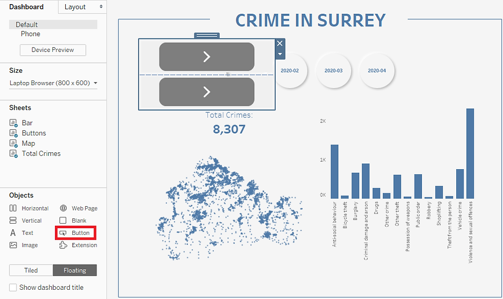
Double click on each of the button objects to format them. In my case, I made the colour for the dashboard I’m on blue and the other one grey, to make it clear which dashboard the user is currently viewing. I changed the ‘Button Style’ to ‘Text Button’ and used the names of the dashboards for the buttons (you can choose to use your own images if you would like) and positioned the layout container where I wanted the ‘menu’ to appear


Which should end up looking something like this:

Then all you need to do is click on the drop-down arrow for that layout container and select ‘Add Show/Hide Button’

This will by default give you a ‘X’ icon which will perform the action of hiding the container. Position this where you would like the ‘Menu’ button to sit and re-size as preferred

When the workbook is published to e.g. Tableau Server/Public/Online there will now be this functionality to show and hide the container – you can try this out in Desktop either by going in to presentation mode (F7) or by holding down the Alt key and clicking the button

You can also change the images used for the ‘Show’ and ‘Hide’ buttons by either double clicking the button or clicking ‘Edit Button’ from the drop-down menu (note you will have to do this separately for both ‘states’ of the button if you want to change both the images)

Navigate to the other dashboard and do repeat the steps as above, but switching the colour of the button to highlight that the user is now on the ‘Surrey Population’ dashboard

And there you have it – quick and simple intuitive dashboard navigation!


Chill fonts are all about laid-back vibes. I recently used chill fonts on a summer event flyer, and they perfectly captured that easy-going atmosphere. They feel casual but still stylish, so they’re ideal for lifestyle projects, beach-themed promotions, or even personal blogs. If you want to add a relaxed, friendly mood to your design, chill fonts can set the perfect tone without being too formal or serious.