Tableau Bitesize: Highlighting Areas on a Line Chart
- James Goodall

- Jun 15, 2023
- 3 min read
Every day you learn something new! And even though this one is pretty basic, I thought it was cool. This time – highlighting periods on a line chart
I was building a dashboard for a customer where I wanted to filter various charts, but keep the line chart showing the whole period, and also indicate which period was being shown here to provide context

The answer it turned out was very simple – just a case of using reference lines with different fills above and below
This blog post will detail how to achieve this nice-looking bit of functionality (and as a bonus should be a pretty quick one) and build a little dashboard along the way. We’ll look to build a couple of charts which we’ll filter, then the line chart which we’ll highlight sections of
We’ll be using the ‘Sample – EU Superstore’ dataset for this task so the first step will be to connect to this
Create a bar chart of the SUM of [Sales] against [Category] and format to your choosing

Create a new sheet that contains a BAN of the SUM of [Sales] and format to your choosing

Create a heatmap by dragging [Order Date] onto the Columns shelf, set as MONTH (as a discrete dimension), [Order Date] again onto the Rows shelf, set as WEEKDAY (as a discrete dimension), then drag the SUM of [Sales] onto the Colour mark and (you guessed it), format to your choosing

We will then create 2 parameters that will be used as a filter on these 3 sheets, and reference it to highlight the final chart we create in a minute
Right click on [Order Date] and select ‘Create Parameter’

Call this ‘Date From Parameter’ and set it up as follows

Duplicate this parameter (by right clicking on it and selecting ‘Duplicate’) then edit the parameter to set it up as follows, naming it ‘Date To Parameter’

Next, create a calculated field called ‘Date Filter’ set up as follows

[Order Date] >= [Date From Parameter]
AND
[Order Date] <= [Date To Parameter]
Drag this onto the Filters card, set to ‘True’ and apply it to the 3 sheets we have created so far (note: do this by using ‘Apply to -> Selected Worksheets’ and not ‘Apply to -> all using this Data Source’)

And for our final sheet, we will create the line chart. Do this by dragging [Order Date] onto the Columns shelf, set as MONTH (as a continuous measure) and the SUM of [Sales] onto the Rows shelf and again format as you like

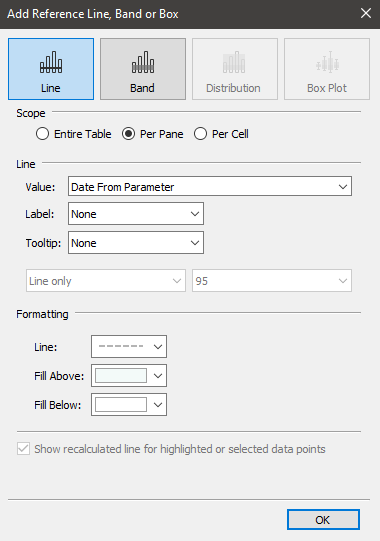
Right click on the X axis header and select ‘Add reference line’

As the ‘Value’ choose the ‘Date From Parameter’ we previously created, and in the ‘Formatting’ section, format the line as you like, but in the ‘Fill Above’ section choose the colour that you want the highlighted section to be, and in ‘Fill Below’ choose the colour to match the background of your workbook (e.g. if you have a white background, select white to be the ‘Fill Below’ colour)
Next, right click again o the X axis header and choose ‘Add reference line’ then set it up as follows, electing the ‘Date To Parameter’ in the ‘Values’ option, formatting the line as you like, then in the ‘Fill Above’ section choose the same colour as your background colour – e.g. what we put in the ‘Fill Below’ section on the other reference line, but leave the ‘Fill Below’ section on this one as ‘None’
And really that’s all there is to it – when we change the parameter values it will adjust the reference line (and filled in areas) as well as filtering the other charts
Combine all of your charts onto a Dashboard and lay it out as you like, then just remember to add the Parameter selectors in (Analysis -> Parameters) and there you go – an interactive dashboard that will filter charts based on a date selection and highlight the selected area on the line chart
Although basic, I think this adds a nice little touch to dashboard and maintains the context of a line chart without filtering it


Comments