Tableau Bitesize: Rounded Bar Charts with Gradient Fill
- James Goodall

- Nov 27, 2020
- 2 min read
It's been a little while since I last posted a blog; with so much going on both in my personal and professional life I've let this slip a little bit, but I'm hoping I can find the time to write a bit more from here on.
A slightly simpler post this time, but one I hope you will find useful – this post will go through the process of creating rounded bar charts with a gradient fill. I find it’s a much prettier way that doing the traditional basic bar charts and it should be quite a quick one.

The dataset I'll be using for this is a .csv file of unemployment in England, broken down by lower tier local authority (LTLA) taken from the gov.uk website, and this post will focus on the LTLAs in Surrey.
Start off by connecting to the dataset attached below:
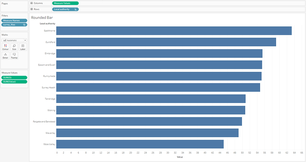
On a sheet called ‘Rounded Bar’, drag ‘Measure Values’ to the ‘Columns’ shelf and ‘Local authority’ to the ‘Rows’ shelf

Next, double click somewhere in the ‘Measure Values’ card and just enter ‘0’ (which will then default to 'SUM(0)')

Leave only the ‘SUM(0)’ and ‘SUM(Value)’ measures in the view

Now the worksheet is currently showing all lower tier local authorities – for the purpose of this post, we only want to show those in Surrey, and to do this we’ll create a set
Right click on the ‘Local authority’ dimension and select ‘Create -> Set’

Add to this set the following values and call the set ‘surrey_ltlas’
· Elmbridge
· Epsom and Ewell
· Guildford
· Mole Valley
· Reigate and Banstead
· Runnymede
· Spelthorne
· Surrey Heath
· Tandridge
· Waverley
· Woking

Drag this Set onto the ‘Filters’ card, change the view to ‘Entire View’ and sort the Local Authority in descending order by the field Value (sum)
Ok so you might be thinking this is just a basic bar chart right? And you’d be right to do so - let’s make this look pretty in just a few clicks
Change the chart type to ‘Line’, drag the ‘Measure Names’ field to ‘Path’ and increase the size

Ok that’s the rounded bars sorted (simple as that), but now what about the gradient fill? Well, luckily we can take advantage of something we’ve already done here – because the ‘Measure Names’ is sitting on the ‘Path’ mark, we can just copy this across to also sit on the ‘Colour’ mark and choose our colours for the two measures in the view; ‘0’ and ‘Value’

Drag the ‘Time’ value to the filter card as a discrete dimension and filter to a year, then it’s just a case of some cosmetic bits and pieces

Remove all lines / shading etc and format the local authority name descriptions to your choosing and hide the headers

Finally we want to add a label
Drag the ‘Value’ field to the ‘Label’ mark and set it up as follows:


Now it’s just a case of creating a dashboard from the sheet, adding a title etc and including the filter, and to make it a bit more interesting, we can also add some animations
Tableau Public Interactive version below:


Download YouTube Thumbnail for Cosmetic
Hi Andrei! Great to hear this was useful, thanks for the feedback! Regarding the transitions, I have animations turned on on my workbook and set to 1 second (on the dashboard go to 'Format -> Animations').
Animations came in version 2020.1 so if you're using a version earlier than this, then this feature won't be available.
great and quick trick! thank you, just quick question: when changing the year in the filter, the bars change fluently, how exactly did you manage that? i downloaded your workbook and recreate it myself with the superstore data, but mine is just super fast changing when using filters, any tips? thank you for your post!