Tableau Bitesize: Progress To Target - Needle Gauge Chart
- James Goodall

- Jan 8, 2021
- 2 min read
This post will go through the process of creating what I’ll call a ‘Needle Gauge’ chart (simply to differentiate it from the typical semi-circle gauge chart). The inspiration for this one came from the gauge chart I saw used in Adam E McCanns' KPI Options viz

This, together with the other blog posts in the ‘Progress to Target’ series will use the ‘progress_dummy_data.csv’ file attached below:
This file contains dummy data related to 5 teams – it has just 3 columns: ‘ID’, ‘Team Name’, and ‘Target Met’ and is therefore recording which teams have met their particular (generic) target
As with the other blog posts in this series, start off by creating a parameter from the ‘Team Name’ field:


You can then choose a team from the list of parameters – in this example I will be using ‘team_3’
To begin with, let’s create the fields we will need to build this chart type
‘Total Met Target FIXED’:

{FIXED [Team Name]:SUM(IIF([Met Target],1,0))}
This one simply records a ‘1’ value whenever the team has a TRUE value for the ‘Met Target’ field which we can then use to calculate the %. I have used a FIXED LOD because my data is at row level – if your data is already aggregated before it comes in to Tableau then you can just use SUM(IIF([Met Target],1,0))
% Met Target FIXED

[Total Met Target FIXED]/ {FIXED [Team Name]:COUNT([progress_dummy_data.csv])}
X

IIF([Team Name]=[Team Name Parameter],1+SQRT(2) * COS((1-[% Met Target FIXED])*180*PI()/180),1)
Y

IIF([Team Name]=[Team Name Parameter],1+SQRT(2) * SIN([% Met Target FIXED]*180*PI()/180),1)
Drag the X field onto the Columns shelf and the Y field onto the Rows shelf, both as Dimensions

You’ll see now that we have two points, the anchor, set at a value of 1, then the % value
Right click on the ‘Category Parameter’ parameter and select ‘Show Parameter Control’
If you then change the parameter you should see the value move around. However, the axis is also changing dynamically with this, so we will need to fix this. Edit the X axis to the following.

Now edit the Y axis

Change the cart type to ‘Line’ and now we’re getting somewhere

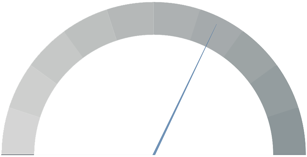
For my gauge, I wanted it to taper off as it goes towards the edge (like a needle). To do this, first create a calculated field called ‘Needle Gauge Size’:

IF [X] = 1 THEN 1 ELSE 0 END
Drag this onto the Size card

We’re almost there!
Remove all lines and border and hide the headers

OK now all we need is a background
I have create an image which segments the border of a semi-circle into 10 equal sections (for each 10% block) – please feel free to use this (I struggled to find a good template anywhere but hopefully this will help if you need one)

Save the above image, then on the sheet, click on ‘Map -> Background Image -> progress_dummy_data’

Select the downloaded file and enter the following in the X & Y values (note they match the axes values entered earlier

And you’re good to go!
I hope you found this useful but if you have any questions – please feel free to leave a comment below!
Because of the nature of the chart – it’s recommended that this would only be used in scenarios where 100% is the maximum value you would expect to see
The workbook on Tableau Public below contains all of the chart types used in the ‘Progress to Target’ series, including this one


Comments