Tableau Bitesize: Progress To Target - Gauge Chart
- James Goodall

- Jan 8, 2021
- 3 min read
This gauge chart is the type people most commonly think of when they hear the words gauge chart, but it’s not quite as straight forward as it might first appear. The method I used to create this is the one Toan Hoang used in this blog

This, together with the other blog posts in the ‘Progress to Target’ series will use the ‘progress_dummy_data.csv’ file attached below:
This file contains dummy data related to 5 teams – it has just 3 columns: ‘ID’, ‘Team Name’, and ‘Target Met’ and is therefore recording which teams have met their particular (generic) target
As well as this, we’ll need to join on another dataset (‘path’ – attached below) via a cartesian join (that is a full out join, joined on 1 to 1)

As with the other blog posts, start off by creating a parameter from the ‘Team Name’ field:


Next, create a calculated field called ‘Team Filter’ as follows:
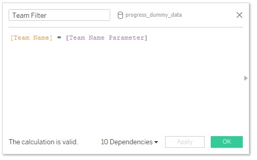
[Team Name] = [Team Name Parameter]
Then drag this to the Filters card and select ‘True’

You can then choose a team from the list of parameters – in this example I will be using ‘team_3’
To begin with, let’s create the fields we will need to build this chart type
‘Total Met Target FIXED’:

{FIXED [Team Name]:SUM(IIF([Met Target],1,0))}
This one simply records a ‘1’ value whenever the team has a TRUE value for the ‘Met Target’ field which we can then use to calculate the %. I have used a FIXED LOD because my data is at row level – if your data is already aggregated before it comes in to Tableau then you can just use SUM(IIF([Met Target],1,0))
% Met Target FIXED

[Total Met Target FIXED]/ {FIXED [Team Name]:COUNT([progress_dummy_data.csv])}
Index

(INDEX()-1)*2
Next, create another field called ‘max_type’

WINDOW_MAX(MAX([Type]))
The next one is ‘max_value’:

WINDOW_MAX(MAX([Percentage]))/100
Create another calculated field called ‘Zero’ (this is basically a dummy field we’ll be using for a label later on):

Now, the way we’ll be creating these is via a polygon chart type, so we’ll need to plot our X & Y coordinates. Create a calculated field called ’X’ as follows:

IF [max_type] = "Foreground" THEN
IF [Index] <= 180 THEN
COS(RADIANS([Index]*[max_value]))
ELSE
COS(RADIANS((362-[Index])*[max_value]))*2
END
ELSE
IF [Index] <= 180 THEN
COS(RADIANS([Index]))
ELSE
COS(RADIANS(362-[Index]))*2
END
END
And then another called ‘Y’:

IF [max_type] = "Foreground" THEN
IF [Index] <= 180 THEN
SIN(RADIANS([Index]*[max_value]))
ELSE
SIN(RADIANS((362-[Index])*[max_value]))*2
END
ELSE
IF [Index] <= 180 THEN
SIN(RADIANS([Index]))
ELSE
SIN(RADIANS(362-[Index]))*2
END
END
We’ll want to colour our charts, so create a calculated field called ‘Colour’ as follows:

IF [max_type] = "Foreground" THEN 'Blue'
ELSE 'Grey'
END
The last thing we’ll do is create some bins from our ‘Path’ measure. Right click on ‘Path’ and select ‘Create -> Bins’

Then set the bin size to 1

Ok so now we can start building our charts
Drag the ‘X’ field onto the ‘Columns’ shelf, then the ‘Y’ field onto the ‘Rows’ shelf

Change the chart type to ‘Polygon’ and drag the ‘Path (bin)’ field to the ‘Path’ mark

Next, right click the ‘X’ field and select ‘Compute Using -> Path (bin)’

Then do the same for the ‘Y’ field and you should have something like this

Next, edit the horizontal (X) axis to reverse the order

Drag the ‘Colour’ field onto the ‘Colour’ mark and the ‘Type’ field onto the ‘Detail’ mark and set the colours as preferred

Next, right click the ‘Colour’ field and select ‘Compute Using -> Cell’

Now we’ll want to bring the ‘Foreground’ shape to the front so right click on the ‘Type’ field and click ‘Sort’

Then set it up as follows:

And you should have something like this:

And we’re nearly there!
Format the sheet to remove all gridlines and borders and hide the headers

Drag the ‘Zero’ field onto the ‘Columns’ shelf, select ‘Dual Axis’ and change the chart type to ‘Text’. Remove the ‘Measure Names’ from the colour mark on both cards, then also remove the ‘Colour’ field from the second Text card and finally drag the ‘max_value’ field onto the ‘Text’ mark (and format to your choosing)

Phew – we made it!
I hope you found this useful but if you have any questions – please feel free to leave a comment below!
Because of the nature of the chart – it’s recommended that this would only be used in scenarios where 100% is the maximum value you would expect to see
The workbook on Tableau Public below contains all of the chart types used in the ‘Progress to Target’ series, including this one


Comments