
Tableau Bitesize: Progress To Target - Donut Chart

This post will go through the process of creating a donut chart in Tableau

Actually – to call it a donut chart is a little misleading – what we’re actually doing it creating a pie chart with a circle over the top of it, but hey, if it looks like a donut, quacks like a donut….
This, together with the other blog posts relating to the ‘Progress to Target’ viz will use the ‘progress_dummy_data.csv’ file attached below:
This file contains dummy data related to 5 teams – it has just 3 columns: ‘ID’, ‘Team Name’, and ‘Target Met’ and is therefore recording which teams have met their particular (generic) target
As with the other blog posts, start off by creating a parameter from the ‘Team Name’ field:


Next, create a calculated field called ‘Team Filter’ as follows:
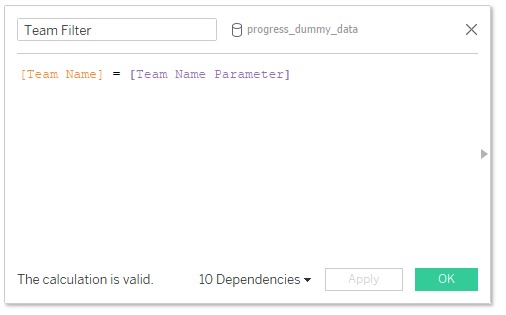
[Team Name] = [Team Name Parameter]
Then drag this to the Filters card and select ‘True’

You can then choose a team from the list of parameters – in this example I will be using ‘team_3’
To start off with the donut chart, we’ll need to create a few more calculated fields
0

MIN(0)
‘Total Met Target’:

SUM(IIF([Met Target],1,0))
This one simply records a ‘1’ value whenever the team has a TRUE value for the ‘Met Target’ field which we can then use to calculate the %
Total Not Met Target

SUM(IIF([Met Target],0,1))
This will simply record the inverse of the previous calculation
% Met Target

[Total Met Target] / COUNT([progress_dummy_data.csv])
OK and we’re ready to go
Start off by dragging the ‘0’ field twice onto the ‘Rows’ shelf and set it as ‘Dual Axis’

Synchronise and hide the headers, then remove all lines and borders

Next, change the ‘bottom’ layer (the ‘0’ field on the left of the dual axis) to a pie chat and the top / right one to a circle

On the Pie Chart mark, drag ‘Measure Names’ to Colour and ‘Measure Values’ to Size then leave only the fields AGG(Total Met Target) and AGG(Total Not Met Target) (ensuring that AGG(Total Met Target) is on the top

On the Circle mark, change the colour to white and reduce the size slightly

Change the colours on the pie chart to those of your choosing (I usually go for a washed out grey for the count field then a bolder colour for the other, as in the above image)
On the Circle mark, drag the ‘% Target Met’ field onto label and format to your choosing

And that’s all there is to it! I hope you found this useful but if you have any questions – please feel free to leave a comment below!
Because of the nature of the chart – it’s recommended that this would only be used in scenarios where 100% is the maximum value you would expect to see
The workbook on Tableau Public below contains all of the chart types used in the ‘Progress to Target’ series, including this one


I find developing practical IT skills in Bielsko easier to think about when there is a concrete question to start from. Solving a small real problem can make a technical lesson easier to remember. That connection helps me see why IT skills in Bielsko can be worth a closer look. I can imagine different answers depending on the situation, so I would want to understand the context before drawing conclusions. What beginner project would connect classroom IT skills with everyday use?
When it comes to building confidence in everyday communication, I would rather understand one useful detail properly than rush through a long list of ideas. Practising a small conversation can make speaking up feel more manageable. It also gives the phrase communication confidence a clearer meaning than a label on its own. A short discussion of an everyday example would make this easier for me to connect with, especially as someone still learning about the subject. Which low-pressure activities help someone become more comfortable expressing an idea?
The subject of exploring the paths taken by graduates feels more interesting when there is room for a reader to stop and ask their own questions. A career story can show the changes and decisions that a short job title leaves out. That connection helps me see why graduate career pathways can be worth a closer look. I am more curious about the process than a polished result, because the steps in between are usually where questions appear. Which questions would make an interview with a graduate useful for current students?
I find making maths understandable through clear examples easier to think about when there is a concrete question to start from. Following one worked example slowly can reveal the reasoning behind a method. This is why I would approach mathematics learning support with a specific question rather than a fixed expectation. I am still thinking through the details, and a small example would help me picture how this works in practice. What helps a learner move from copying a solution to choosing a method independently?
The topic of finding agreement through respectful discussion gives me a few things to think about, especially when the discussion moves beyond general advice. Listening for a shared concern can make disagreement easier to work through. It gives me a more concrete starting point for thinking about consensus building skills. The part I would like to explore further is what happens when the idea meets a real situation with its own limitations. What helps a group move towards a decision while keeping different views visible?