Tableau Bitesize: Progress To Target - Plum Pudding Chart
- James Goodall

- Jan 8, 2021
- 2 min read
This post will detail how to make a circular waffle (or plum pudding) chart, and is only possible thanks to this blog post by Kizley Benedict

We will need 2x data sources for this one and we will complete the chart using Blending.
This, together with the other blog posts in the ‘Progress to Target’ series will use the ‘progress_dummy_data.csv’ file attached below:
This file contains dummy data related to 5 teams – it has just 3 columns: ‘ID’, ‘Team Name’, and ‘Target Met’ and is therefore recording which teams have met their particular (generic) target
The second data source we need is a template file for the plum pudding chart (attached below) that I have created which plots the X and Y coordinates for the various single percentage values. You can amend this if you do not like the positioning of the percentages
Using the plum pudding waffle chart template as the primary data source, drag the X and Y fields to their respective shelves, both as Dimensions

Using the ‘progress_dummy_data.csv’ as the secondary data source, create 2x Calculated Fields called
‘Total Met Target’:

SUM(IIF([Met Target],1,0))
This one simply records a ‘1’ value whenever the team has a TRUE value for the ‘Met Target’ field which we can then use to calculate the %
% Met Target

[Total Met Target] / COUNT([progress_dummy_data.csv])
Create a parameter from the ‘Team Name’ field:


Next, create a calculated field called ‘Team Filter’ as follows:
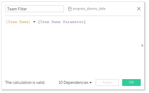
[Team Name] = [Team Name Parameter]
Back in the plum_pudding_template data source, create a calculated field called ‘Colour’ as follows:
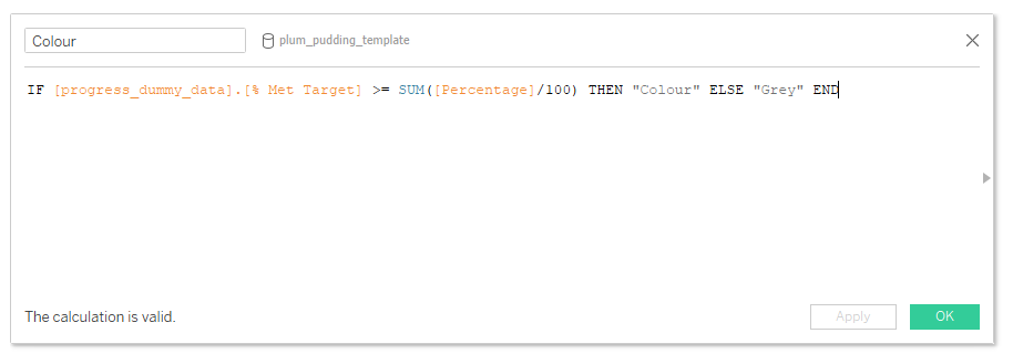
IF [progress_dummy_data].[% Met Target] >= SUM([Percentage]/100) THEN "Colour" ELSE "Grey" END
Drag this field onto the ‘Colour’ mark, select colours of your choosing and change the chart type to a shape you’d like – in my example I used Circle, but you could choose anything you want

Drag the ‘Team Filter’ field from the ‘progress_dummy_data’ data source onto the Filters card and set it as True

Then remove all lines and borders and hide the headers

Once you drag it on to a dashboard you can change the size of the container to create more of a circular shape
You can add some labels in the form of annotation, however, if the data is likely to change then this isn’t really an option as it will disappear each time the data changes
I would instead opt to create a separate sheet with just the value as text and display that alongside the waffle chart in a dashboard
I hope you found this useful but if you have any questions – please feel free to leave a comment below!
The workbook on Tableau Public below contains all of the chart types used in the ‘Progress to Target’ series, including this one


Comments