Tableau Bitesize: Progress To Target - Filled Shape Chart
- James Goodall

- Jan 8, 2021
- 2 min read
This bitesize post details how to create a filled shape chart

This is cheating a little bit, because to think of the name, you’d expect this to be made using polygons or something similar (and this could in all likelihood be done), however all this really is is a bar chart with an image containing a transparent element overlaid
This, together with the other blog posts in the ‘Progress to Target’ series will use the ‘progress_dummy_data.csv’ file attached below:
This file contains dummy data related to 5 teams – it has just 3 columns: ‘ID’, ‘Team Name’, and ‘Target Met’ and is therefore recording which teams have met their particular (generic) target
As with the other blog posts, start off by creating a parameter from the ‘Team Name’ field:

Next, create a calculated field called ‘Team Filter’ as follows:
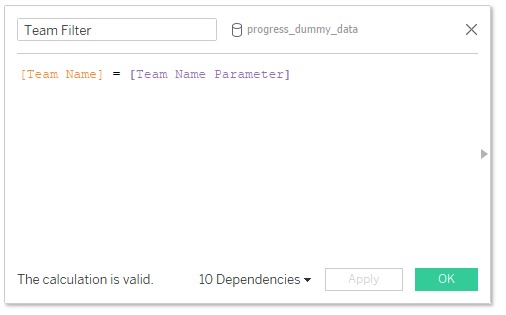
[Team Name] = [Team Name Parameter]
Then drag this to the Filters card and select ‘True’

You can then choose a team from the list of parameters – in this example I will be using ‘team_3’
To begin with, let’s create the fields we will need to build this chart (only 2 yay!)
‘Total Met Target’:

SUM(IIF([Met Target],1,0))
This one simply records a ‘1’ value whenever the team has a TRUE value for the ‘Met Target’ field which we can then use to calculate the %
% Met Target

[Total Met Target] / COUNT([progress_dummy_data.csv])
Drag the ‘% Met Target’ field onto the rows shelf

Edit the Y axis and fix the value at 0 and 1

Pick a background colour (I went for light grey) by clicking on ‘Format -> Shading’ then picking a colour from the ‘Worksheet’ drop-down)

Remove the borders and lines and hide the header
Click on ‘Show mark labels’ and format to your choosing (I chose to align this in the middle centre)

Finally, change the size to the max

And that’s all we need to do as far as the sheet goes!
Create a dashboard and drag your sheet on to it

Now, we just need to create an image which has the desired shape set as transparent, leaving the edges to be the same colour as the background of the dashboard
In this case, I’m just using a triangle shape – save the image below to your computer then add it as a floating object to the dashboard on top of the worksheet

Then it’s just a case of manually moving and resizing the image / sheet until you get the view you are after

And that’s all there is to it!
As a note to remember - by adding this image over the top, you will lose any hover over tooltip functionality.
I hope you found this useful but if you have any questions – please feel free to leave a comment below!
The workbook on Tableau Public below contains all of the chart types used in the ‘Progress to Target’ series, including this one


Comments